
When I came across this watch, I immediately fell in love with it.
This is the 1:Face watch.

There is an interesting concept lying behind the 1:Face watches: there are 9 different colours whereof each one supports a good cause.
So how does it support that certain good cause? Well, a part of the sum you paid for the watch gets donated to the specific charity you chose.
I went with the white one and despite the long waiting-time (international shipping from the US to Belgium), mine finally arrived.
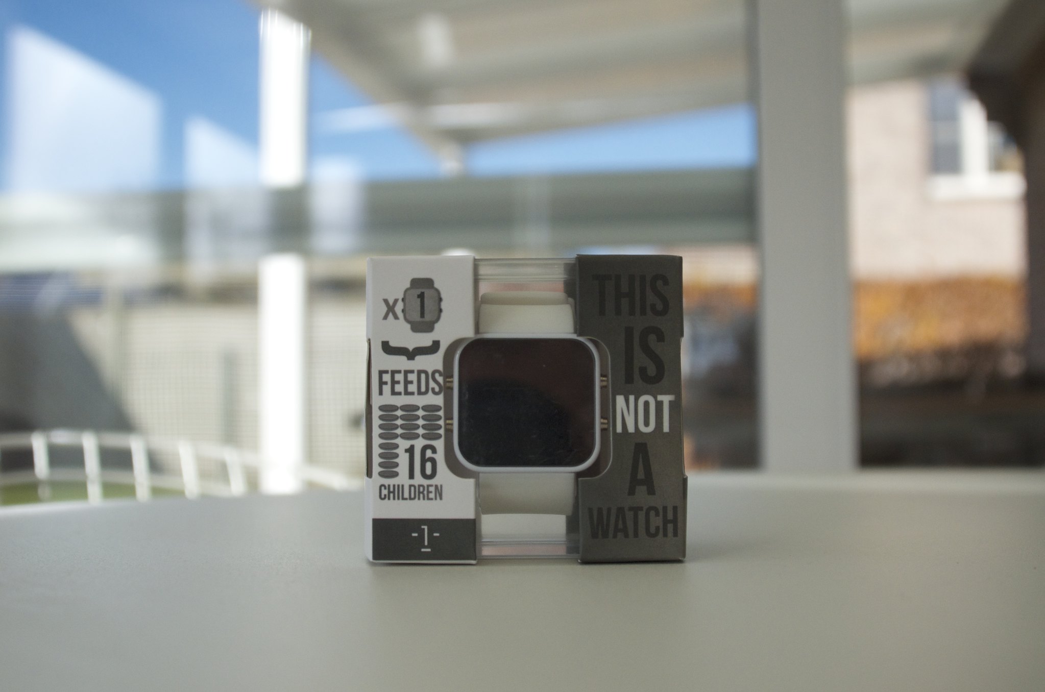
The packaging exists of a plastic boxwith 2 enclosing cardboard parts that,
when put together, it mimics the simple shape of the watch.
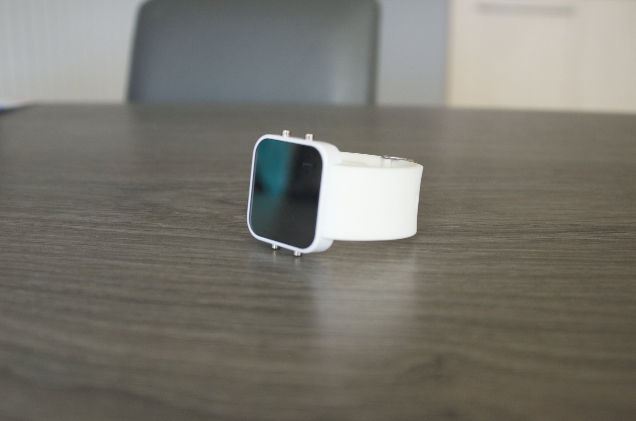
Here it is.

I really like the minimalistic approach they took, the front of the watch has a mirror-like effect when you look at it from above and turns darker or lighter when you turn it away.
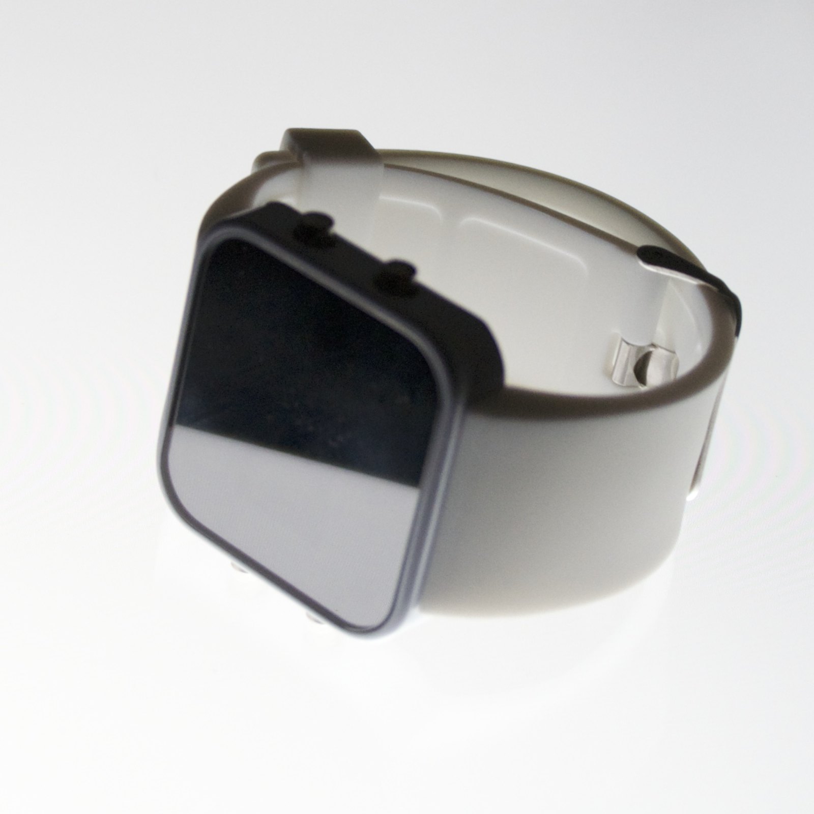
The bottom is a metal plate with a coarse finish, adding character to its entity.
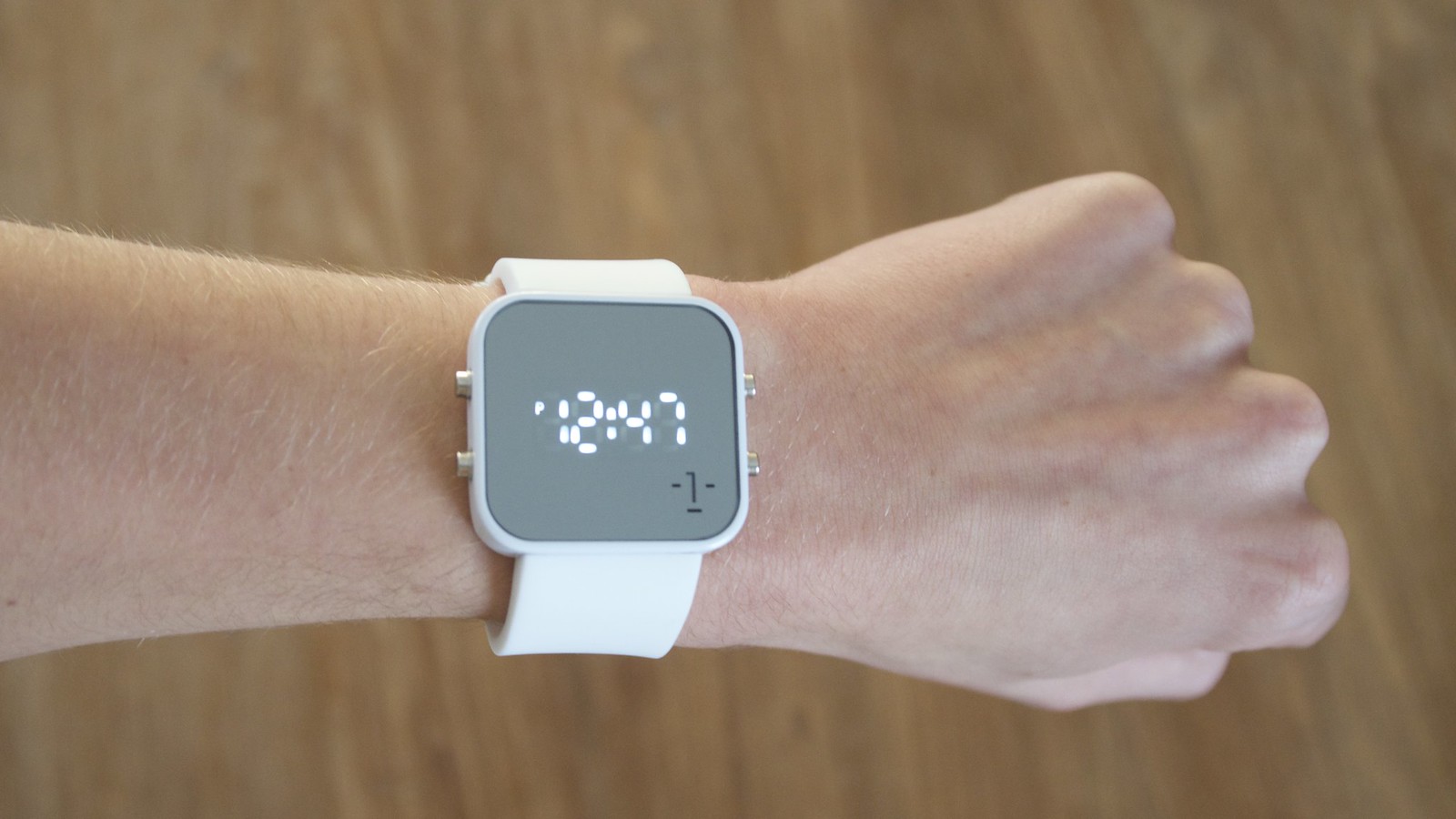
To get back to the screen, they've done a great job blending the part of the screen
where the digits appear in the rest of the screen.
You may have noticed that on the packaging there was a big catchphrase saying "This is not a watch"
with further explanation on the side saying how they would be lying if something that feeds a child, quenches a thirst or provides a cure can be labeled as just watch.
I think it's a good way of helping to get the message across to the customer.
The clean 1:Face logo on the front complements the fresh design, though I think it would be better if it was a little bit smaller and was in the middle at the bottom,
creating a harmonious symmetry when you look at it.
Overall, I'm pretty satisfied with the watch and I'd really recommend it to everybody.
It's clean, it's beautiful and you support a good cause by purchasing one for $40.
If you're interested, you can go visit their site at 1facewatch.com